
Medium Article:
Fashion Changes but
Design Endures
What Chanel’s Online Experience Can Teach Us About Usability
Photo by Laura Chouette on Unsplash
Read the article on Medium.
Published August 4, 2021
We can learn about the cognitive psychology that informs our design decisions, but seeing how these principles come together in the products we genuinely enjoy is much more powerful. Then, once we feel the impact of good design, we can translate that emotion into our own work.
I’ve always been interested in fashion and beauty, and one of my favorite products is the website for the iconic fashion house, Chanel. I respect and admire the brand and its online experience. Chanel.com encapsulates all of the brand’s aspirational minimalism while wearing multiple hats: marketing tool, e-commerce platform, and digital museum exhibit. And although I’m a fan, I’m also a designer and recognize the website is not perfect. However, the effective use of design principles allows the “good” to outweigh the “bad”, making chanel.com a successful product. Five design principles in particular help make this possible:
Aesthetic-Usability Effect
Aesthetic and Minimalist Design Heuristic
Consistency and Standards Heuristic
Visibility of System Status Heuristic
Text Contrast Ratio
I could wax poetic about the brand’s long, storied history, its mythical namesake, and breathtaking haute couture collections. I could even share my collection of Karl Lagerfeld memes. But I think Pulitzer Prize-winning fashion critic Robin Givhan (2018) says it best:
“A lot of people have this grand, mythical idea of what fashion is and what a fashion designer is like, and the mythology of Chanel fulfills that. Chanel means fashion to people, and you know…
Fashion with a capital F.”
— Robin Givhan
Founded in 1909, Chanel’s 112 years of heritage have allowed the brand to transcend from a global fashion house to a cultural touchpoint, albeit for many, an aspirational one. Traveling museum exhibitions highlighting the life and work of Gabrielle Chanel are a testament to the brand’s allure. And while the brand’s cachet is undisputed, Chanel is also an extremely successful and still privately-owned company with global pre-pandemic sales topping $12.3B in 2019. The brand’s ability to capitalize on its lore and spread the fashion gospel to a broad audience is a massive part of this success. Chanel.com maximizes this marketing strategy and drives sales through a robust e-commerce platform that makes its products more accessible, if not more affordable.
As a luxury fashion brand, we expect that anything associated with Chanel will be beautiful, and its website is no exception. The pleasing aesthetics also make it more usable, and this is one of the most critical design principles used throughout the product. Kate Moran (2017) of the Nielsen Norman Group describes this aesthetic-usability effect as increased tolerance of minor usability issues in visually appealing interfaces. In the well-known “ATM study,” researchers Masaaki Kurosu and Kaori Kashimura had participants perform simple banking tasks on different versions of ATMs. Participants perceived the ATMs with more aesthetically pleasing button and screen layouts to be more usable, and Kurosu and Kashima (1995) suggested that “…interface designers should strive not only improve the inherent usability but also brush up the apparent usability or aesthetic aspect of the interface.” (p. 293)
In his book Emotional Design, Don Norman recounts the initial skepticism of those findings by Israeli scientist Noam Tractinsky. Tractinsky assumed that Japanese aesthetic tradition influenced the findings of the 1995 study and that replicating the study in Israel would yield different results. Norman (2005) says, “Not only did he [Tractinsky] replicate the Japanese findings, but — contrary to his belief that usability and aesthetics ‘were not expected to correlate’ — the results were stronger in Israel than in Japan.” (p. 18). Norman summarizes this and other findings saying, “…attractive things make people feel good, which in turn makes them think more creatively. How does that make something easier to use? Simple, by making it easier for people to find solutions to the problems they encounter.”

Stacked CTA images exemplify chanel.com’s implementation of aesthetics.
Users experience the aesthetic-usability effect on chanel.com through the use of beautifully styled and photographed CTA images of equally beautiful models and objet d’art. These images are typically presented in expansive landscape orientations that occupy the entire screen width, sometimes stacked. These bold, vibrant visuals are offset by large sections of white space that mimic the architectural technique of compression and release. The result is a beautiful balance of excitement and serenity, intensity and tranquility. This aesthetic is quintessential Chanel and presents users with an experience that is aesthetically pleasing, and as research suggests, also perceivably usable.
Chanel.com takes the aesthetic-usability effect one step further through the use of video and music content. Users are mesmerized by exquisitely filmed HD recordings of Chanel fashion shows, complete with overlaid soundtracks. The default for these presentations is full-screen viewing which further immerses users in the brand experience. Music is a powerful medium that can reinforce a brand’s identity, with now-defunct Parisian fashion boutique Colette being a notable example. The Chanel sound, a très French blend of disco, electro, and punk, is featured throughout the website’s video presentations and digital features. Users can even expand the experience by streaming official curated “The Sound of Chanel” playlists on Apple Music. This enhanced use of the aesthetic-usability effect charms users while making it easier to solve potential usability problems creatively.
This powerful and intentional use of aesthetics is nothing new for fashion brands. Long before the rise of the internet or even Don Norman, fashion brands have capitalized on the aesthetic-usability effect. For most people, a $50k Birken bag is less useful than a $50 JanSport backpack. Yet, cognitive psychology suggests that the pleasing aesthetics of the Hermès will make people more tolerant of its limitations. Fashion brands parlay their knowledge of aesthetics to their online presence in the digital age. In the case of chanel.com, this is a wise move. Having to market and promote more than a century’s worth of “content” while maintaining a multi-billion dollar e-commerce platform is no easy feat, and there are bound to be areas of opportunity. Baymard Institute’s 2021 E-Commerce UX Benchmark Report highlights these opportunities and gives chanel.com’s e-commerce platform a mediocre score of 50.3. The report found significant problems in the website’s search and product layout. Chanel.com can capitalize on its experience as a fashion house and utilize the aesthetic-usability effect as a buffer against these usability issues.
Users are provided “just enough” information to achieve their goals with easy access to more details.
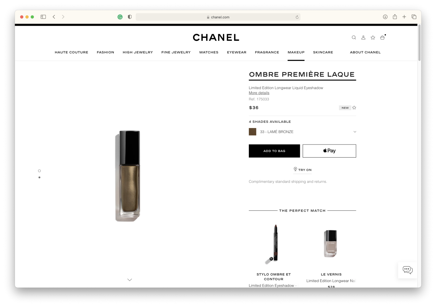
Chanel.com’s use of the aesthetic-usability effect is enhanced through aesthetic and minimalist design. At its core, Chanel is abstract minimalism, which is evident throughout its online experience. Earlier I discussed how the website used compression and release to balance the visual “weight” of the site design. The provision of just enough information to users also conveys this balance. This design choice helps to simplify the vast amount of information on the site. Largely absent are long blocks of text. The brisk, poetic writing style approaches haiku-like simplicity; the product description for the Ombre Première Laque reads, “A longwearing liquid eyeshadow that leaves a metallic veil on lids for a mesmerizing look.” Likewise, the site’s simple yet stylish black and white interface does not compete with the featured content. Navigational links are clear and concise and manage to organize a tremendous amount of content with ease. As Nielsen (2020) says, “…it’s about making sure you’re keeping the content, and visual design focused on the essentials.” This streamlined delivery aligns with the brand’s minimalist aesthetic and makes it easier for chanel.com users to achieve their goals.
Consistency is something that Chanel takes very seriously. In the world of luxury goods, consistency is synonymous with quality, and this is how brands build trust and maintain their reputations. In interaction and user experience, this design principle is expressed more specifically through consistency and standards. Not only does this heuristic help reduce cognitive load while increasing learnability, but it also supports aesthetic and minimalist design by preventing users from becoming distracted from their primary goals. Chanel.com predictably displays similar types of information in similar ways across the entire site. For example, product specifics for cosmetics and fragrances are always organized into five sections: Description, More Details, Reviews, Q&A, and Online Services, allowing users to locate information predictably. In addition, many of chanel.com’s navigational elements are consistent with industry conventions (e.g., the top-right position of the shopping bag icon, clicking the brand logo returns users to the homepage, etc.). As a result, users don’t have to learn a new pattern, making the website more usable.

“Digital Features” on chanel.com use a different layout but are still recognizably Chanel.
The consistency and standards heuristic always reminds me of the adage, “If it ain’t broke, don’t fix it.” This saying is mostly true, but there’s something to be said for intentionally breaking a pattern to surprise users. This powerful design choice must be made strategically: the fashion equivalent of a simple black outfit contrasted with a bold, colorful piece of jewelry. In UX, this is accomplished through the relationship between internal consistency (the harmony of elements within a product) and external consistency (the unity among different products or offerings from the same brand).
As engineering psychologist Michael Zuschlag (2010) describes, “If one part of your product must be externally inconsistent, the same inconsistency had better exist throughout your entire product to maximize internal consistency.” Chanel.com implements this technique in areas of the site devoted to the brand’s history. These “digital exhibitions” are more immersive pages and can be considered a different offering within the website. With an emphasis on visual and interactive elements, these layouts are distinct from other website areas yet are still recognizably Chanel. This deliberate external inconsistency surprises and captivates users. However, the arrangements of these digital exhibitions are consistent with each other, precisely the balance that Zuschag recommends. This skillful improvisation allows chanel.com to direct users’ attention where needed while maintaining enough consistency to reduce cognitive load.
Chanel’s online experience has a lot going on, and navigating all of this information and content has the potential to be overwhelming. But, as Nick Babich (2020) summarizes so clearly, “No one likes to be lost, but it happens both in real and digital worlds. So making users aware of where they are in the app is essential for creating a good navigation experience.” That’s why it’s so important to include elements that relay this information to users. This key provision of Nielsen’s visibility of system status heuristic is used extensively on chanel.com and helps make the site usable.

Sleek black bars act as “wayfinders” to let users know their location within chanel.com.
Multiple wayfinding elements help to highlight users’ location at the site level. For example, when viewing the product page for Chanel №5, a sleek black bar at the top of the page indicates the user is in the “Fragrance” area. Breadcrumbs at the bottom of the page assist by providing a hierarchical view of users’ location within the website. The black bars are also used within the product pages to let uses know what type of information they are viewing. During checkout, these elements are once again used to let users know their position in the process (e.g., Delivery Method, Billing, etc.). Carousel image indicators are another implementation of this heuristic that helps users position themselves within the abundant and often expansive visual elements.
Letting users know the site received their inputs is another critical piece of the visibility of system status heuristic and spares users from wondering, “Is this thing working?”. On chanel.com, this is accomplished with hover states and (stylish) animations that indicate the system is processing user inputs. These are also industry standards that users expect, so their inclusion supports a reduced cognitive load and easy learnability.
Designers should consider accessibility from the outset of their process. The Web Content Accessibility Guidelines (WCAG) 2.1 contains 78 compliance criteria to help ensure interfaces are inclusive to all users, and they’re all critical. However, I’m going to narrow in on one guideline of particular importance: text contrast. In a study on heuristic methods to evaluate accessibility, researchers Acosta-Vargas et al. (2019) identified insufficient color contrast as a “severity barrier” of concern for users with low vision in their analysis of 40 sites. These findings underscore the importance of considering contrast in our designs. WCAG 2.1 guidelines indicate that text should have a contrast ratio of 7:1 (4.5:1 for large-scale text). Chanel.com exceeds these guidelines with text contrast ratios between 10.70:1 and 17.49:1 on all menus and controls. Although the black and white color scheme is part of the brand’s minimalist aesthetic, the high-contrast text also means chanel.com is usable for a broad audience.
Products, much like people, are not perfect, and chanel.com is no exception. However, the effective use of design principles ensures that products are enjoyable and usable while providing the space to address opportunities. This is how I define a successful product, and chanel.com is a beautiful example. As an iconic fashion brand with over a century of design experience, Chanel maximizes what cognitive psychology has taught us about usability: beautiful products work better. Or, at least they’re perceived to work better, which is an important design tool. Abstract minimalism and a commitment to consistency, both key to the brand’s success in fashion and beauty, help to enhance this effect. Design principles also help to make the wealth of information and content on chanel.com more navigable and accessible for a wide range of users.
Chanel.com is one of my favorite products. The brand’s online experience inspires, educates, and occasionally motivates me to buy. Exploring the emotions elicited by our favorite products makes us more empathetic in our work as designers, and as Don Norman (2005) suggests, “…the emotional side of design may be more critical to a product’s success than its practical elements.” So I encourage you to find something you enjoy and seek to understand why you enjoy it through a design principles lens; I’m confident that you’ll find it just as valuable as I did.
References
Acosta-Vargas, P., Antonio Salvador-Ullauri, L., & Lujan-Mora, S. (2019). A heuristic method to evaluate web accessibility for users with low vision. IEEE Access, 7, 125634–125648. https://doi.org/10.1109/access.2019.2939068
Babich, N. (2020, April 28). 4 ways to communicate the visibility of system status in UI. UX Planet. https://uxplanet.org/4-ways-to-communicate-the-visibility-of-system-status-in-ui-14ff2351c8e8.
“Chanel’s E-Commerce UX.” Chanel E-Commerce UX Case Study — Baymard Institute, baymard.com/ux-benchmark/case-studies/chanel.
Givhan, R. (2018). CHANEL Haute Couture Fashion Show. 7 Days Out. episode, Netflix.
Kurosu, M., & Kashimura, K. (1995). Apparent usability vs. inherent usability. Conference Companion on Human Factors in Computing Systems — CHI ’95. https://doi.org/10.1145/223355.223680
Moran, K. (2017, January 29). The aesthetic-usability effect. Nielsen Norman Group. https://www.nngroup.com/articles/aesthetic-usability-effect/.
Nielsen, J. (2020, November 12). 10 usability heuristics for user interface design. Nielsen Norman Group. https://www.nngroup.com/articles/ten-usability-heuristics/.
Norman, D. A. (2005). Emotional design: Why we love (or hate) everyday things. Basic Books.
Zuschlag, M. (2010, July 19). Achieving and Balancing Consistency in User Interface Design. UXmatters. https://www.uxmatters.com/mt/archives/2010/07/achieving-and-balancing-consistency-in-user-interface-design.php.